GENERAL
What Are Strip Charts? Time-Based Visualization for Smart Systems
Imagine watching your heart rate fluctuate in real time during a workout or monitoring industrial temperatures that could mean the difference between safety and disaster. In both cases, strip charts are the silent workhorses behind the scenes, turning raw time-based data into meaningful visuals.
What is a Strip Chart?
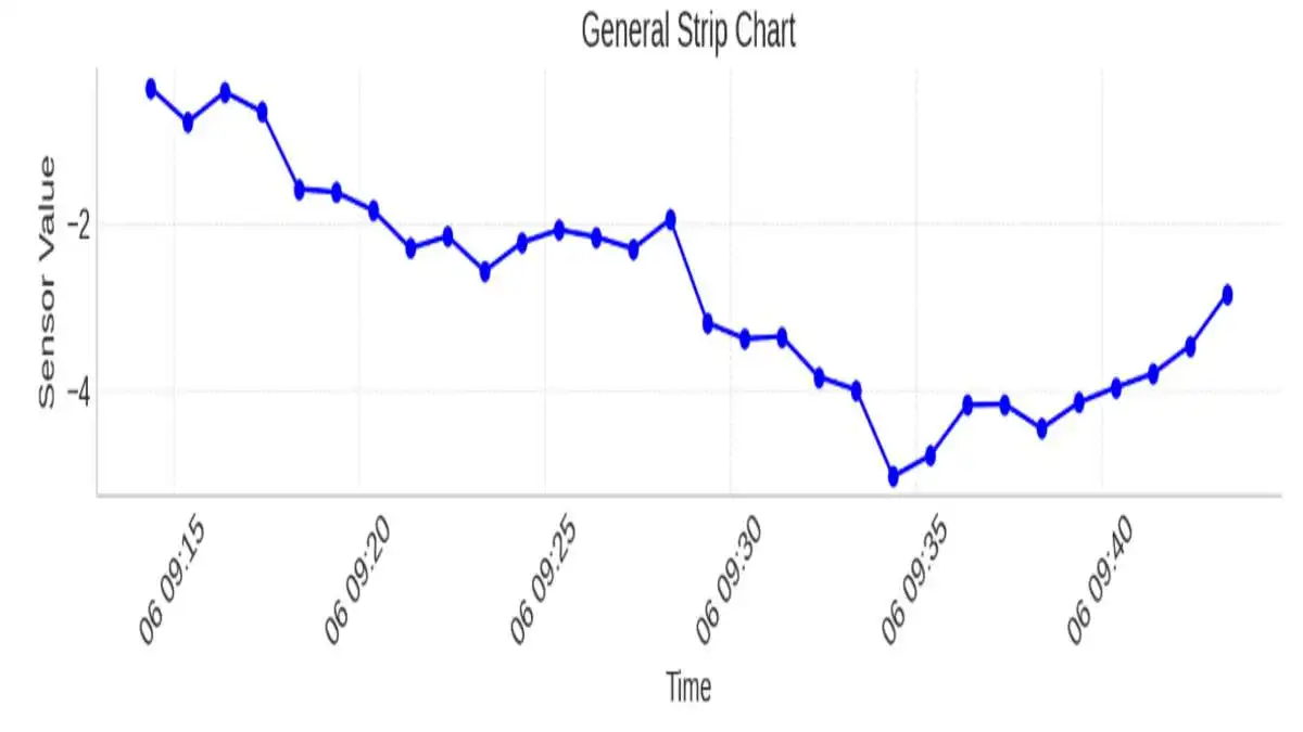
A strip chart is a straightforward method to show data over different periods. One or more variables are depicted along a horizontal line representing time, which allows users to notice changes or unusual events in their data as they happen or after recording. Strip charts are constructive in healthcare, laboratory settings, and on analytics dashboards for seeing how results change over time.
How a Strip Chart Works
Data points shown on a strip chart move across a line, following how the variable changes over time. Usually, the X-axis is used for time, either as it occurs or as it is recorded in steps, and the Y-axis is used for the measured variable. Because the chart updates continuously, it is best for spotting trends, issues, or differences in system speeds.
In analog formats, ECG records are made as a paper strip drawn by a pen-like stylus. Software in digital tools works the same way by rendering every image frame after frame.
Uses
- Healthcare Monitoring: Used in ECG, EEG, and respiratory monitoring.
- Industrial Systems: Monitor temperatures, voltages, or pressure in real-time.
- Scientific Research: Record time-series data in controlled experiments.
- Finance: Visualize rapid stock or commodity price fluctuations.
- IoT & Embedded Systems: Track sensor output like humidity or GPS movement.
Strip Chart vs. Line Chart vs. Dot Plot
Types of Strip Charts
Strip charts come in various formats depending on the application and complexity. These include:
- Single-variable: Track just one metric (e.g., heart rate).
- Multi-variable: Show multiple time series on the same axis, often color-coded.
- Real-time: Update continuously with incoming data.
- Recorded: Display archived or historical datasets for analysis.
Each type has its strengths—real-time charts are great for monitoring, while recorded charts help in retrospective analysis.
Creating Strip Charts in R
Use stripchart() from base R.
Example:
- stripchart(mpg ~ cyl, data=mtcars, method=”jitter”, pch=19, col=”blue”)
Key Parameters:
- method = “jitter” prevents overlap.
- pch defines point shape.
- Grouping with formulas (e.g., y ~ group) improves readability.
- Supports vertical and horizontal orientation.
Tip: R is particularly good for statistical strip charts rather than live monitoring.
Creating Strip Charts in Python
Python offers multiple ways to create strip charts, most notably through the seaborn library.
Here’s a sample using stripplot():
- Import seaborn as sns
- import matplotlib.pyplot as plt
- stripplot(x=”cylinders”, y=”mpg”, data=dataset, jitter=True)
- title(“MPG vs Cylinders”)
- show()
- Use jitter=True to prevent data overlapping. For time series data, use matplotlib’s plot_date() for date-time handling.
Creating Strip Charts in Excel
Use a scatter plot to simulate a strip chart.
Steps:
- Enter time in Column A and values in Column B.
- Insert → Scatter Plot → Format markers only.
- Remove lines to mimic a strip chart.
Pros: Easy, no coding required.
Cons: Not ideal for high-frequency or live data.
Interpreting Strip Charts Like a Pro
To get the most from a strip chart:
- Look for clusters or spacing—these may indicate patterns or abnormalities.
- Trends are often subtle; combine with line overlays when needed.
- For real-time systems, set alerts when points fall outside thresholds.
“Strip charts tell you not just what is happening, but when and how often.” — Data Visualization Handbook, 2023
Always adjust the time axis scale based on the frequency of events. Too wide, and the chart loses meaning; too narrow, and it gets noisy.
Common Mistakes to Avoid
- Overplotting: Too many variables or points make the chart unreadable.
- Poor labeling: Time intervals must be clear and consistent.
- Inappropriate chart type: Sometimes, a line or bar chart is more effective.
- No jittering: For grouped data, always enable jitter to separate overlapping points.
Advanced Variations and Interactive Strip Charts
Modern data visualization libraries like Plotly or D3.js allow strip charts to become interactive:
- Hover tooltips
- Zoom and pan
- Click-to-highlight series
These are great for dashboards and allow exploration data analysis, especially for large time-series datasets.
Frequently Asked Questions (FAQs)
1. What’s the main purpose of a strip chart?
They are used to visualize changes in data over time, especially when you want to monitor real-time variables or highlight data distribution across time intervals.
2. Can they show multiple variables?
Yes. You can plot multiple series in different colors or layers, but you must take care to avoid clutter.
3. Is it the same as a jitter plot?
Not quite. A jitter plot is a specific variation of a strip chart used to avoid overlapping in categorical data distributions.
4. How can I make my strip chart more readable?
Use jittering, clear time axis labels, color coding, and avoid plotting too many variables at once.
5. Are strip charts good for presentations?
Yes, especially for showing time-based patterns, but consider pairing with line charts for clearer trend visualization.
Final Thoughts
Strip charts are both easy to use and full of useful information. They help us understand what is happening now in systems, like heart monitors, and show how shifts in data can be linked to events. No matter if you’re in R code, Python script, or displaying results in a live dashboard, learning to use strip charts will improve your understanding of timing in your data.


What Is Telemetryczny? A Complete Guide to Telemetric Systems
The Polish word telemetryczny means telemetric, i.e., the techniques and devices applied to measure, collect, transmit, and analyze data at...


Best AI Image Editor and Face Swap of 2026.
When you are looking at the most preferable edit pictures with AI applications and Magic Hour face swap websites in...


Why LeahRoseVIP Is the Go-To Digital Magazine for Modern Wellness
🌿 “Wellness is no longer a luxury—it’s a lifestyle. And LeahRoseVIP is leading the charge.” In a digital world flooded...


MyFastBroker.com: A Game-Changer for Modern Investors
itMyFastBroker.com is website designed to connect people and businesses with expert brokers in loans, business transactions, insurance, and mortgages. The...


XAI770K: Enhancing Data Security and Efficiency with AI-Blockchain Synergy
XAI770K presents an innovative platform which unites advanced artificial intelligence (AI) features with block chain technology capabilities to produce progressive...


Corsage: A Beautiful Tradition That Never Fades
Corsage is an elegant and thoughtful floral accessory that has defied generations and has not been set aside by passing...


HCOOCH CH₂ H₂O: Structure, Properties, and Industrial Applications
The complex compound HCOOCH CH₂ H₂O serves multiple industrial purposes in pharmaceutical applications along with organic synthesis and environmental science....


Princess Kazer: The Legendary Tale of Generosity, Bravery, and Leadership
Princess Kazer’s reputation endures generations because of the way her name sparkles in tradition. Due to her exceptional bravery combined...


Mannacote: Natural Coating for Safe Crop Protection
Food insecurity and plastic pollution are issues the entire world is struggling with, and the urgency of developing safe, sustainable,...


Nexus AlienSync: The AI Nervous System Powering Tomorrow’s Smart Systems
“AI won’t reach its full potential until it can truly communicate across systems. Nexus AlienSync is what makes that possible.”...
-
 BIOGRAPHY10 months ago
Behind the Scenes with Sandra Orlow: An Exclusive Interview
-
HOME1 year ago
Discovering Insights: A Deep Dive into the //vital-mag.net blog
-
HOME2 years ago
Sifangds in Action: Real-Life Applications and Success Stories
-
BIOGRAPHY1 year ago
The Woman Behind the Comedian: Meet Andrew Santino Wife