HOME IMPROVEMENT
Best of the Best: High-Impact Paint Colors That Will Transform Any Room
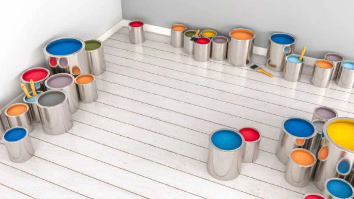
When it comes to transforming your home, few changes are as powerful and cost-effective as a fresh coat of paint. The right color can open up a room, create a cozy atmosphere, or make a bold statement. In this article, we’ll explore the best high-impact paint colors that will elevate your interior design and give your home a whole new vibe.
Why Paint Colors Matter in Interior Design
Color is more than just a visual choice — it affects mood, perception, and even the perceived size of a room. Warm colors like reds and oranges create a sense of intimacy and energy, while cool shades like blues and greens promote relaxation and calm. Neutral tones serve as a backdrop, allowing other design elements to shine, while bold hues can turn walls into statement pieces.
Top High-Impact Paint Colors for Any Room
1. Deep Navy Blue – Classic Yet Modern
Navy blue has emerged as a popular alternative to black. It’s deep, sophisticated, and surprisingly versatile. Use it to create a moody, elegant bedroom or a dramatic accent wall in the living room. Navy pairs beautifully with gold, brass, and crisp white trim, creating a high-end, timeless look.
Tip: If you’re worried about the room feeling too dark, balance navy walls with light-colored furniture and plenty of natural light.
2. Emerald Green – Bold and Earthy
Emerald green brings a rich, natural feel to any space. Its deep jewel tone evokes luxury and pairs well with wood accents, gold hardware, and velvet textures. This color works especially well in dining rooms and home offices, adding a touch of drama without overwhelming the space.
Design Insight: Emerald green works beautifully with botanical elements, such as potted plants and natural fiber rugs, reinforcing the connection to nature.
3. Warm Terracotta – Cozy and Inviting
Terracotta is a warm, earthy color that instantly makes a room feel cozy. Its rich, reddish-orange undertone creates a welcoming vibe, making it perfect for living rooms and kitchens. When paired with neutral furnishings and natural materials like wood and linen, terracotta creates a Mediterranean-inspired aesthetic.
Pro Tip: Use terracotta on an accent wall or in smaller doses through accessories like throw pillows and pottery.
4. Charcoal Gray – Sophisticated Neutral
Charcoal gray is a stylish alternative to black, offering depth without feeling too stark. It pairs well with both warm and cool tones, making it incredibly versatile. Charcoal is a popular choice for modern and industrial-style interiors, especially when paired with metallic finishes and textured fabrics.
Styling Tip: Add pops of color through artwork or decorative accents to prevent the space from feeling too dark.
5. Blush Pink – Soft Yet Chic
Blush pink has moved beyond nurseries and into modern home design. Its soft, dusty tone works well in bedrooms, bathrooms, and even living rooms. Blush pink complements gold and brass fixtures, softening the overall aesthetic without feeling overly feminine.
Design Tip: Pair blush pink with white and gray tones to create a clean, modern look.
6. Rich Burgundy – Dramatic Elegance
Burgundy adds warmth and a touch of luxury to any room. It’s a strong color that works well in dining rooms and bedrooms, especially when paired with dark wood, gold accents, and plush textiles. Burgundy creates a cozy, intimate feel while maintaining a sense of sophistication.
Pro Tip: Use burgundy on a single wall or in smaller doses through furnishings and accessories to avoid overpowering the space.
How to Choose the Right Paint Color
Choosing the right color can feel overwhelming, but here are some tips to make it easier:
✅ Test First: Always test paint samples on the wall before committing. Colors can look different depending on lighting and surrounding décor.
✅ Consider Undertones: Warm and cool undertones can drastically change how a color looks in a room.
✅ Match to Your Style: If your home features modern, Scandinavian, or rustic elements, select colors that complement that aesthetic.
✅ Create Flow: Use a consistent color palette throughout your home to create a sense of cohesion.
Pairing High-Impact Colors with Other Design Elements
Once you’ve chosen your paint color, it’s essential to balance it with other design elements:
- Lighting: Warm tones look best under soft, yellow lighting, while cool tones work well with natural or white light.
- Furniture: Neutral furnishings allow bold colors to shine, while patterned fabrics can add texture and interest.
- Accessories: Metallic accents (like gold and brass) add warmth, while black and white elements create contrast.
Best Paint Brands for Lasting Impact
For long-lasting color and coverage, consider using high-quality brands known for their durability and rich pigmentation:
- Benjamin Moore – Known for its rich color depth and smooth finish.
- Farrow & Ball – Premium brand with a sophisticated color palette.
- Sherwin-Williams – Wide range of finishes and excellent durability.
Where to Find More Inspiration
If you’re ready to explore more high-impact color options, check out our catalog for a curated selection of paint colors and design ideas.
Conclusion
A fresh coat of paint can do wonders for any space. Whether you’re drawn to the drama of navy blue, the warmth of terracotta, or the elegance of burgundy, choosing the right high-impact color can elevate your home’s style and atmosphere. Experiment with different shades, and don’t be afraid to step out of your comfort zone — the results could be truly transformative.


What Is Telemetryczny? A Complete Guide to Telemetric Systems
The Polish word telemetryczny means telemetric, i.e., the techniques and devices applied to measure, collect, transmit, and analyze data at...


Best AI Image Editor and Face Swap of 2026.
When you are looking at the most preferable edit pictures with AI applications and Magic Hour face swap websites in...


Why LeahRoseVIP Is the Go-To Digital Magazine for Modern Wellness
🌿 “Wellness is no longer a luxury—it’s a lifestyle. And LeahRoseVIP is leading the charge.” In a digital world flooded...


MyFastBroker.com: A Game-Changer for Modern Investors
itMyFastBroker.com is website designed to connect people and businesses with expert brokers in loans, business transactions, insurance, and mortgages. The...


XAI770K: Enhancing Data Security and Efficiency with AI-Blockchain Synergy
XAI770K presents an innovative platform which unites advanced artificial intelligence (AI) features with block chain technology capabilities to produce progressive...


Corsage: A Beautiful Tradition That Never Fades
Corsage is an elegant and thoughtful floral accessory that has defied generations and has not been set aside by passing...


HCOOCH CH₂ H₂O: Structure, Properties, and Industrial Applications
The complex compound HCOOCH CH₂ H₂O serves multiple industrial purposes in pharmaceutical applications along with organic synthesis and environmental science....


Princess Kazer: The Legendary Tale of Generosity, Bravery, and Leadership
Princess Kazer’s reputation endures generations because of the way her name sparkles in tradition. Due to her exceptional bravery combined...


Mannacote: Natural Coating for Safe Crop Protection
Food insecurity and plastic pollution are issues the entire world is struggling with, and the urgency of developing safe, sustainable,...


Nexus AlienSync: The AI Nervous System Powering Tomorrow’s Smart Systems
“AI won’t reach its full potential until it can truly communicate across systems. Nexus AlienSync is what makes that possible.”...
-
 BIOGRAPHY10 months ago
Behind the Scenes with Sandra Orlow: An Exclusive Interview
-
HOME1 year ago
Discovering Insights: A Deep Dive into the //vital-mag.net blog
-
HOME2 years ago
Sifangds in Action: Real-Life Applications and Success Stories
-
BIOGRAPHY1 year ago
The Woman Behind the Comedian: Meet Andrew Santino Wife